Page 169 - Emeraude 2.60 Tutorial
Basic HTML Version

Emeraude v2.60 – Doc v2.60.01 - © KAPPA 1988-2010
Guided Interpretation #8 • B08 - 25/25
selected slip model(s). The blue curves are for the slippage between water and oil, and the red
curves is for the slippage between gas and liquid. In both cases, the dots are on the slippage
given by the regression.
Overall, the match between the raw data (in red) and Emeraude solution (in green) is good,
even in zones with numerous spikes. And thanks to the Slippage velocity view, it can be noticed
that this match was achived by only a slight departure from the slip models predictions.
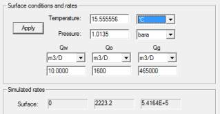
However, when creating the survey, we have entered surface rates [Qw=10m3/D,
Qo=1600m3/D, Qg=465000 m3/D]. We can now compare them with the simulated rates given
by Emeraude.
Go to ‘Inflow rates’ and select the ‘Surface Match’ tab.
Fig. B08.33 • Surface match dialog
Obviously, the simulated results give too much oil and gas. A reason for this can be that the water
production, although small, was ignored: the oil content was then overestimated in the MPT
process because the electrical probes were not considered.
However, entered surface rates are also questionable and several reasons can explain the
difference with the interpretation results:
-
Poor quality PLT measurements
-
Well unstable while logging
-
Surface metering equipment inaccurate
-
Surface measurements made at a different drawdown
-
Surface measurements made at a different time
This concludes Guided Interpretation#8.

