Page 191 - Emeraude 2.60 Tutorial
Basic HTML Version
Emeraude v2.60 – Doc v2.60 - © KAPPA 1988-2010
Guided Interpretation #9 • B09 - 21/22
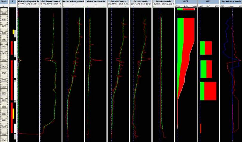
Fig. B09.25 • Interpretation display
Before going further on the solution, it can be noticed that a ‘Slip velocity match’ view has
appeared. This view is meant to show the difference, when interpreting data in Continuous’
mode, between the slippage calculated by the regression process, and that calculated by the
selected slip model(s). The red curve is for the slippage between gas and liquid (the blue curve
is for the slippage between water and oil). The dots appear on the slippage curves coming from
the regression.
Overall, match between raw data (in red) and Emeraude solution (in green) is good, except for
the density, as we did not try to fit this measurement.
However, when creating the survey, we have entered surface rates [Qw=0 stb/D, Qo=4790
stb/D, Qg=17370 Mscf/D]. We can now compare them with the simulated rates given by
Emeraude.
¾
Go to ‘Inflow rates’ and select the ‘Surface Match’ tab.

