Page 34 - Emeraude 2.60 Tutorial
Basic HTML Version
Emeraude v2.60 – Doc v2.60.01 - © KAPPA 1988-2010
Guided Interpretation #1
•
B01 - 32/38
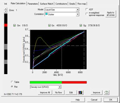
Clicking on the ‘Plot’ button at the bottom left shows a graphical display of the correlations,
and the error, Fig. B01.38:
Fig. B01.38 • Rate calculation dialog: plot mode
The plot shows the density tool response versus possible values of Qliq (here Qo) and Qg for
the current value of the total rate. On the plot, the current value of total rate is displayed with
a vertical dashed line. Allowable values on the X-axis go between 0 and Qt and represent the
oil rate. The difference between Qt and Qo represents Qg. On the Y-axis (density tool
response) a horizontal dashed line shows the measured density (this is an average value of the
density channel across the zone). Colored curves show the simulated density tool response for
various correlations (the active correlation curve is thicker). The current solution is indicated
by a vertical dotted line and the simulated density tool response with a horizontal dotted line.
In this case on the plot the simulated and measured density tool responses are equal, as
shown respectively by the dotted and dashed horizontal lines.
Note: as usual, a right mouse button click in the plot gives access to a contextual menu
gathering the various zoom facilities. A ‘Legend’ option is also available in this menu.
Click on the ‘Flow map’ tab.

