Types of Plots
There are a few types of plots to visualize data in K-A: Item (contextual) plot, User plot, Properties plot, Custom plot, Production plot, and PTA dashboard.
Item Plots
Item plots are also known as Contextual plots. They can be accessible by clicking on a node in the field hierarchy; when clicked, a Plot tab appears to inspect the data.
Most Item plots are created automatically by the platform and available for the following nodes:
Gauge
Filter
Production
Corrected production
Shut-in
Property
Function output
Task output (if any)
K-W document (Saphir, Topaze)
Item plots for K-W documents contain the main plots from the document, if any (LogLog, History, Semilog). Plots for the rest of the above tree items are just data channels with the data values plotted versus time.
Item plots are also available for:
Well
Group of wells
Field
These plots for well, group of wells and field are also automatically created but they are based on the Plot templates that are manually created by a user under the Automation mode. They contain information from the data channels inside the selected node object. The plots can be either time series plots or cross plots with arbitrary number of panes and any number of datasets or properties either on linear or log scale.
The Y-axis units are automatically updated whenever units are changed in the data table.
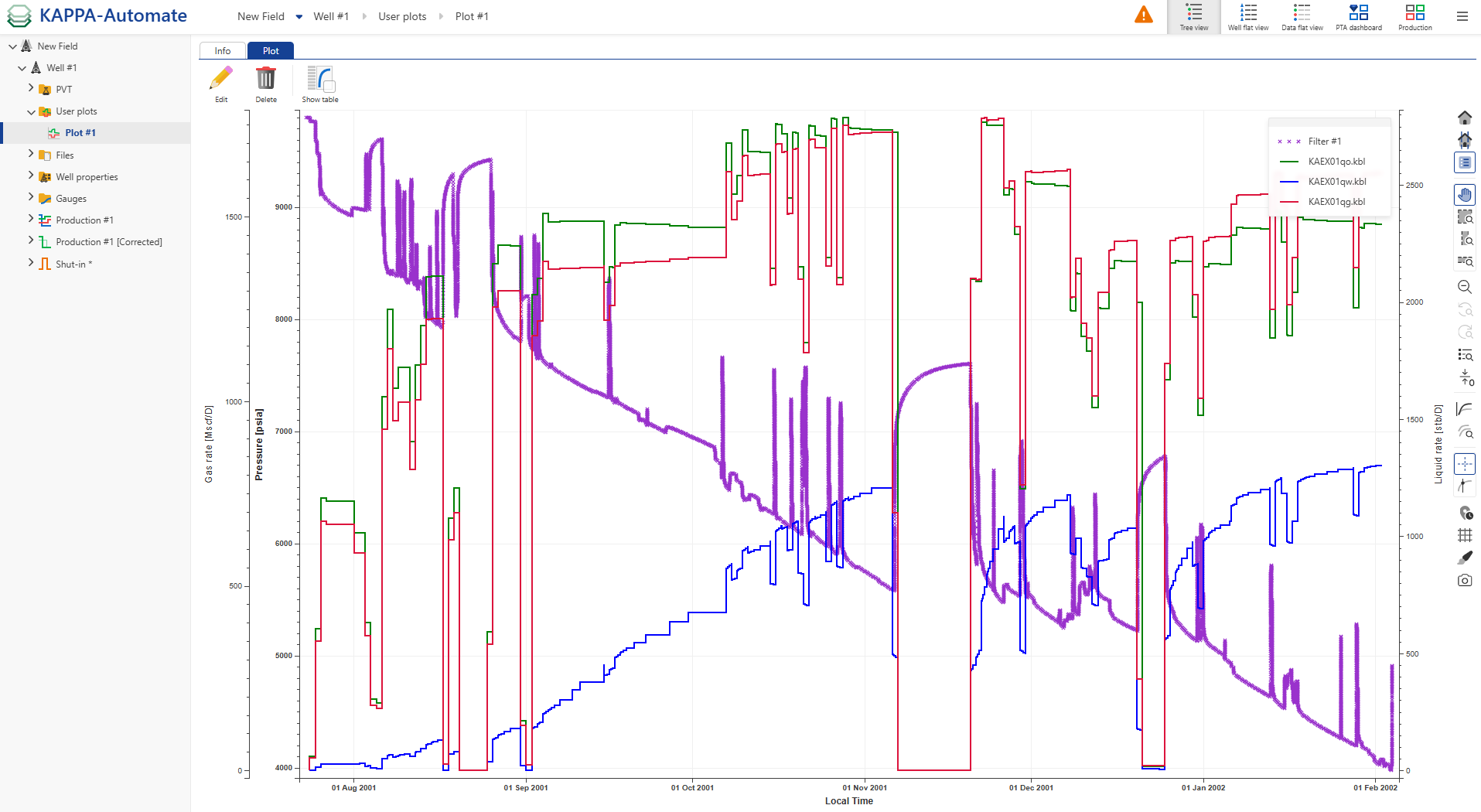
User plot is a manual plot that can be created with any number of panes; each pane can combine data sets and well properties from the field hierarchy plotted versus time. In other words, user plots are a combination of data channel item plots for a selected well which has been defined by a user.
Creating a User Plot
Click Plot ,
 , under the Info tab, e.g., at the well level.
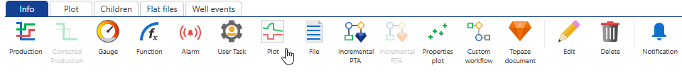
In the Create a new plot dialog, enter a Name and Label if necessary or leave the default one.
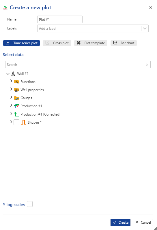
Decide what type of plot you need, Time series , Cross plot or Bar chart.
Select the desired data channels to display, such as Pressure, Gas, and Water.
If Time series plot is selected, the data channels will be plotted vs time.
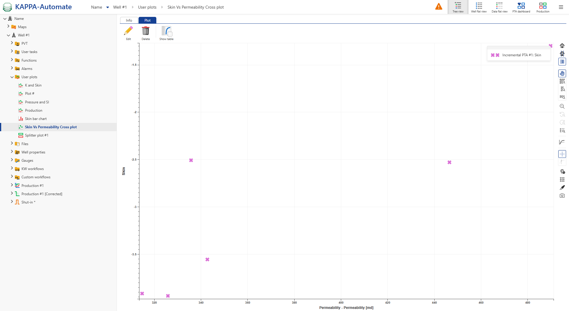
For Cross plot, assign a data channel to the X-axis using the dropdown menu; remaining channels will be plotted against the selected one.
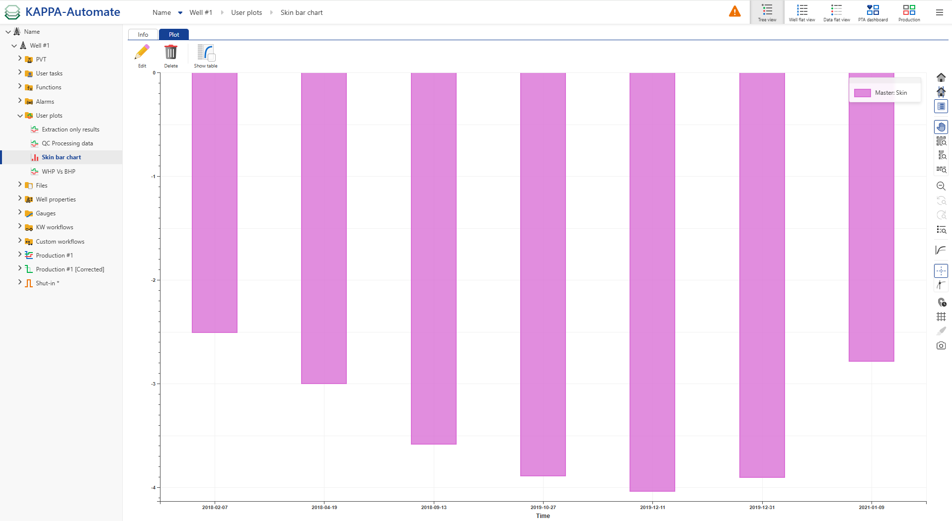
Choosing Bar Chart displays well properties in a bar format. For more details, refer to the section below.
Note
A Plot Template can be applied, as defined at the global K-A level under Automation Mode. Click Plot Template to select and apply the preferred layout.
Logarithmic scales can be applied as follows:
Y-axis: when using a Time Series Plot
Both X and Y axes: when using a Cross Plot.
Users can also search for a specific gauge or well property by name.
Click on Create to confirm the creation. The User plots node, containing the newly created Plot, is added under the Well node.
Tip
The plot can be customized, e.g., the marker type and color of the displayed channels can be changed, by clicking on the Edit aspect,
 , icon in the right-hand side toolbar.
Users can hide or show channels in the plot by clicking the corresponding icons in the legend:
 To show a channel.
 To hide a channel.
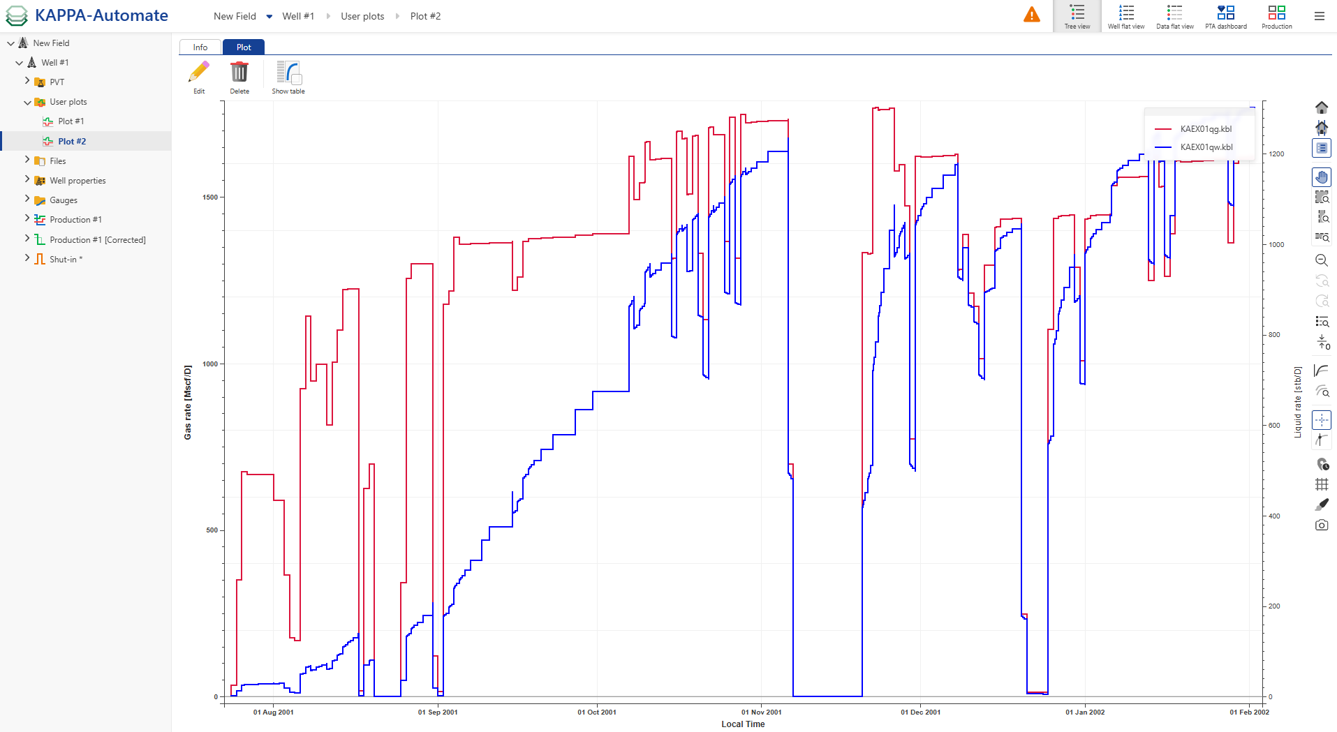
It is possible to create several plots. Under the User plots node, click Plot to create another plot and select e.g., gas and water for the second plot.
The newly created Plot #2 is added under the User plots node.
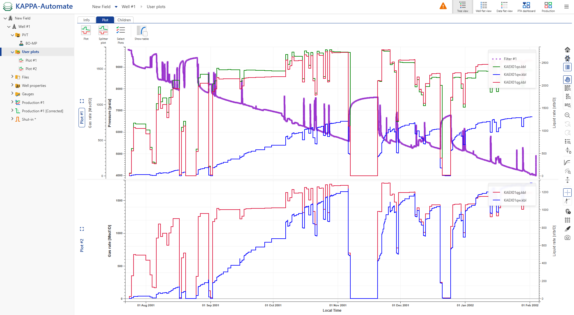
To display multiple user plots together, select the User Plots node in the field hierarchy, click Select plots,
 , and pick the plots to display:
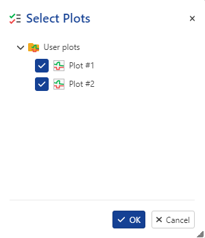
Both plots are then shown together.
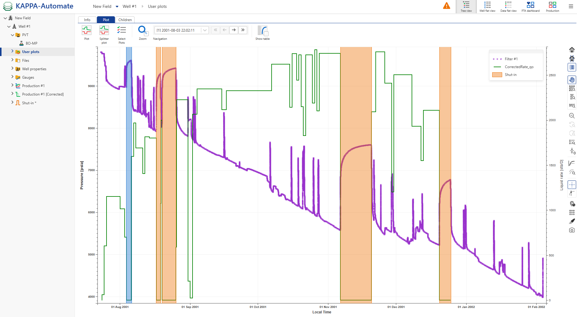
When displaying Shut-in, a zoom option for selected shut-ins and a shut-in navigation bar are added to the options at the top.
Tip
When having several panes displayed, users can maximize a pane for an expanded view by using the Expand view,  , icon and by clicking on the Restore view,
  , icon to collapse the view. Users can also double-click on the pane title to expand or collapse the view.
Note
Container names for well properties are now displayed on the user plot legend, making it easier for users to identify and distinguish different well properties directly on the plot.
Creating a Cross plot
Click Plot ,
, under the Info tab, e.g., at the well level.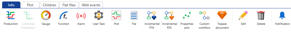
In the Create a new plot dialog, enter a Name and Label if necessary or leave the default one.
Select Cross plot.
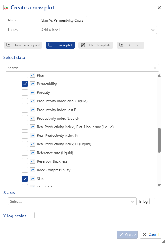
Select the desired well property dataset to display, such as Skin.
Click on Create to confirm the creation. The User plots node, containing the newly created Plot, is added under the Well node.
Creating a Bar chart
Click Plot ,
, under the Info tab, e.g., at the well level.In the Create a new plot dialog, enter a Name and Label if necessary or leave the default one.
Select Bar chart.
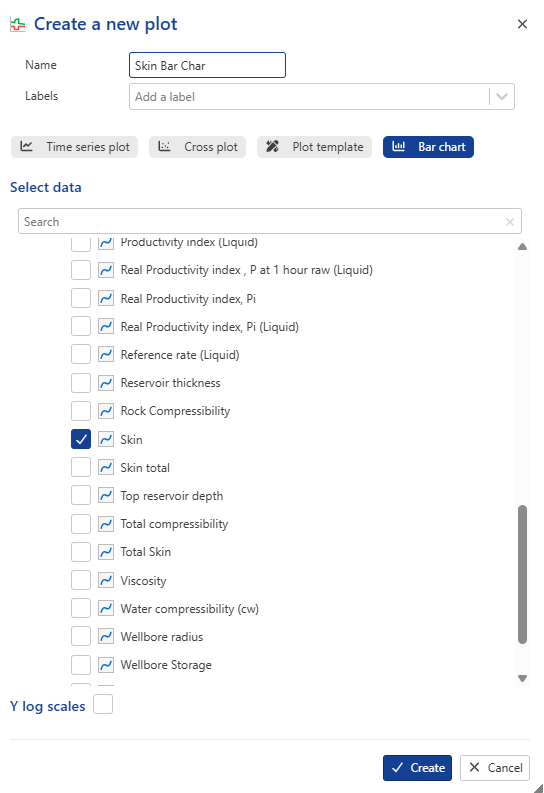
Select the desired well property dataset to display, such as Skin.
Click on Create to confirm the creation. The User plots node, containing the newly created Plot, is added under the Well node.
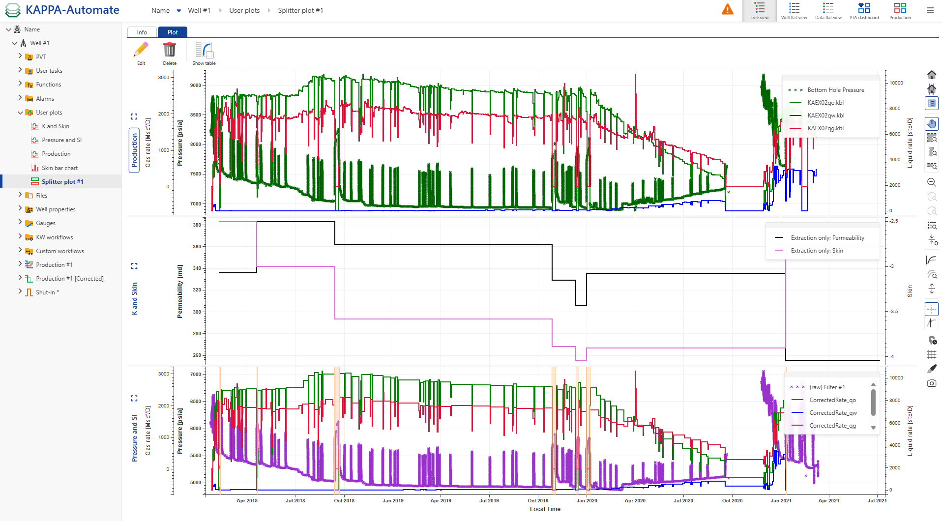
Creating a Splitter Plots
To create a plot combines multiple user plots together, select the User Plots node in the field hierarchy, click Splitter plots,
 , and pick the plots to display:
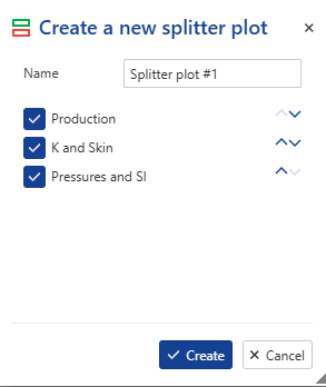
Note
Users can reorder plots using the dedicated button ,
 .
.All the three plots are then shown together.
Workflow clip
User task plot aspect
Distinct colors are automatically assigned when a user's task output comprises multiple datasets of the same type.
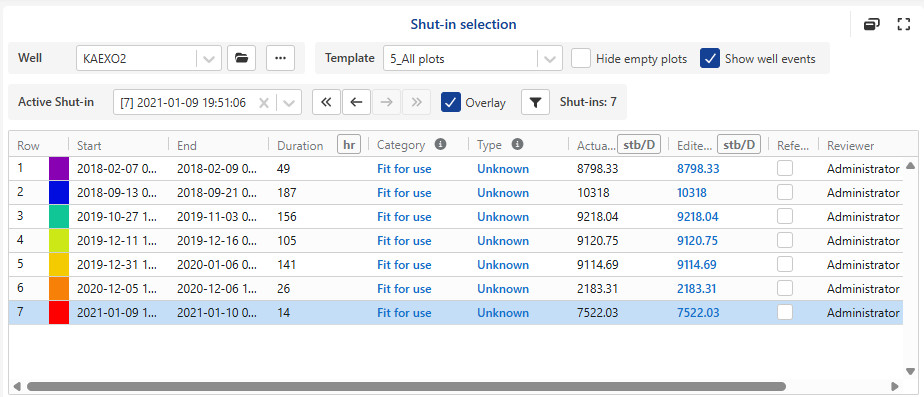
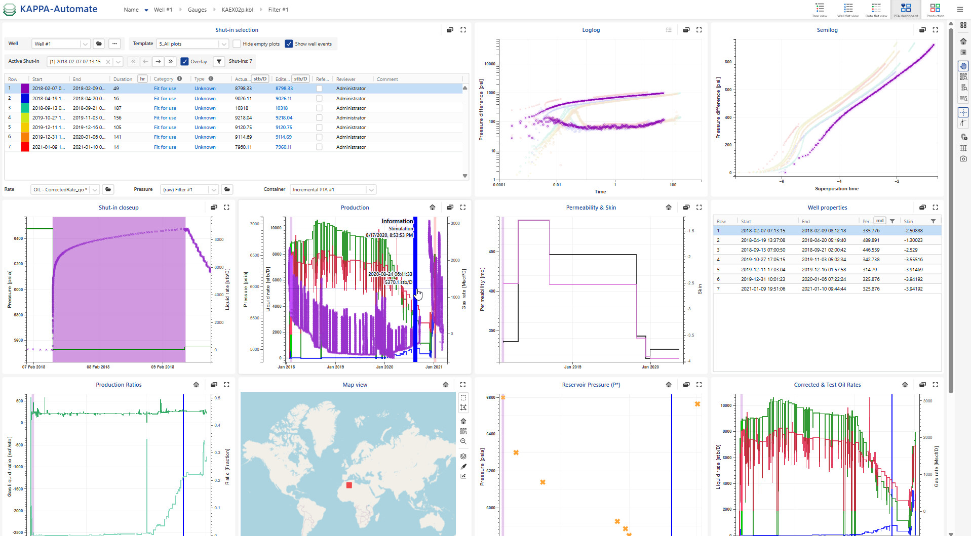
PTA Dashboard
The PTA Dashboard provides comprehensive insight into the performance of a selected well over time, enabling users to monitor shut-in events, pressure, production, and analysis results.
A gauge and production phases must be loaded under one or more wells.
Shut-in events and corrected production must be available.
Optional. iPTA workflow and/or any user task results are defined in dashboard template.
Select the Field in the hierarchy.
Click on the PTA Dashboard,
 , option in the top right toolstrip.
Define the well of interest (multi-well selection can be selected which allows pressure/rate display for others).
Choose the dashboard template to apply.
From the toolstrip, you can :
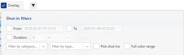
Enable the Overlay option to display all Log-log shut-ins in a single plot.
Hide empty plot to clean up the view.
Show well events.
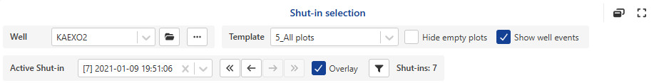
Use the Previous,
 , and Next,
  , options at the top to navigate through the different shut-ins. The zoom will reset to each shut-in.
Click on the Filter,
 . Once selected, shut-ins can be filtered by:
Date range (can be edited graphically or manually).
Duration.
Category.
Type.
Individual Shut-in.
Note
Shut-ins that are not selected are excluded from the log-log plot and greyed out in other plots.
If more than 50 shut-ins are available, only the 50 longest are shown in overlay by default.
Use Full color range when displaying fewer shut-ins to o better distinguish them.
The number of filtered shut-ins is now displayed in the PTA Dashboard.
Select the pressure, the rate data and the well properties container.

View the Well Properties table (e.g., Skin and Permeability), which is automatically displayed when available. It will appear if the PTA dashboard template includes iPTA results.
See one global toolbar in the right hand side toolbar.
All elements in the dashboard can be moved and resized.
Select the active shut-in from any plots.
Only maps that have already been created in the tree view under the selected field are available in the map list. It is not possible to create new maps from the PTA Dashboard view.
To expand/ restore plots, use the Maximize ,
 and Minimize ,
 options.
To detach a plot into a separate window, click on
 .
.
Note
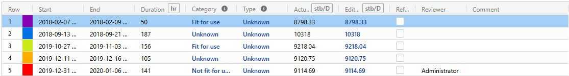
Multiple attributes of shut-ins are included here in the table which is , such as :
Category: fit for use, not fit for use or unknown
Type: hard, soft or unknown
Reviewer: Who flagged the shut-in.
Reference shut-in: it is useful in several process for instance consistency check
Comment
Actual rate:
Edited rate: it is possible to adjust the last rate step value before shut-in if inconsistencies are observed and unexplained (no physical meaning) in the BUs. By editing this value, the log-log plot will shift vertically, the corrected production will be recomputed upon submitting the edited rates, and rates plot will be refreshed accordingly. The option is available when corrected rate is based on the selected shut-in, otherwise is is disabled.
Important
Toggle between Default and Compact layouts by clicking on
 .
.Shut-in info tooltips are added to the Category and Type attributes.
It is possible to select multiple shut-in checkboxes when clicking on the shift key on the keyboard.
Shut-in attributes can be added to the log-log plot legend by clicking on ,
 , and choosing the desired attributes.
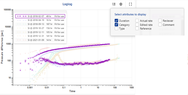
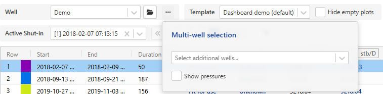
Multi-well selection
This feature helps identify potential interference between wells within the same compartment by displaying production and pressure data on the same plot. It offers a more comprehensive and clearer view of field behavior.
To select multi-well:
Click on
 .
.Select the additional well(s) from the list.
Optionally, check the Show pressure checkbox to include pressure data.
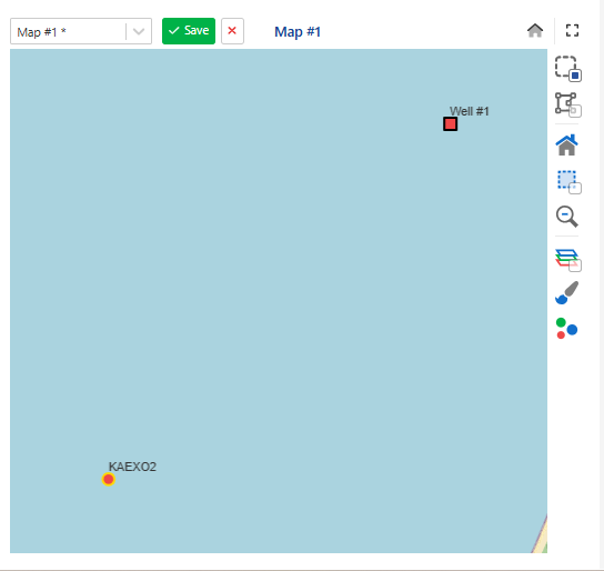
Wells can also be selected directly from the map:
In the map options, choose either:
Rectangular selection ,
 .
.Polygon selection ,
 .
.
Draw a rectangle or polygon on the map to include the wells to be displayed on the history plot.
Note
If the map view aspect is modified, the changes will be saved and persisted when the Save option is selected.
Workflow clip
Production Dashboard
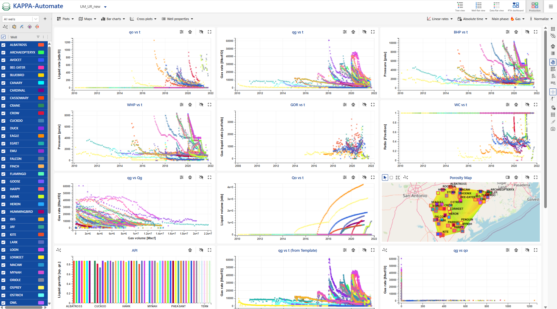
The Production Dashboard provides an integrated workspace for visualizing and managing production data across multiple wells within a field. It enables users to plot production trends from various wells on multiple graphs within a single interface, allowing for easy comparison and quick analysis.
In addition to visualization, the dashboard supports bulk operations such as applying functions, running user tasks, and executing workflows like aRTM and BHP conversions. Model results can also be displayed directly from the same workspace.
An interactive map and a well properties table can be included, providing a complete and centralized overview of the field’s performance.
Production and pressure must exit under the well (s).
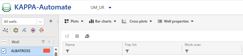
Select the Field in the hierarchy.
Click on the Production Dashboard,
 , option in the top right toolstrip.
Select the working set from the dropdown list.

Important
To create a new working set, click on
 .
.To edit or delete an existing one, click on
 or
or  respectively.
Select the well(s) to be included in the dashboard.
Click on
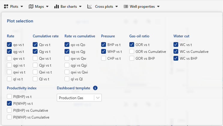
 to open the plot selection dialog.
In the dialog, choose the plot types to display (e.g., production rate, cumulative production, pressure) and define the time unit.
Add maps by clicking on
 . Only maps that have already been created in the tree view under the selected field are available in the map list. It is not possible to create new maps from the Production Dashboard view.
Click on
 to open the well properties bar chart dialog.
In the dialog, select the well properties to display (e.g., Gas specific gravity, Dew point pressure).
Click on
 to open the cross plot dialog.
In the dialog, Select the data type (properties or time series), then choose the X‑axis and Y‑axis variables.
From the toolstrip, various data types can be displayed as plots, along with well properties sourced from a defined container.
The Rate scale can be changed from log to linear and vice versa by clicking on the Log rates,
 , icon.
All these data can be displayed against various time scales (accessible through the Absolute,
 , option), including:
Absolute time: represents the original date.
Production time: represents the time elapsed from the first rate.
Time from peak rate: represents the time elapsed from the maximum rate. The reference phase rate should then be selected.
Time on production: represents the time elapsed from the first rate, with shut-in periods excluded.
Select the Main Phase:
If Gas is selected, the calculated PI is gas PI.
If Oil is selected, both oil PI and liquid PI are calculated.
Time scales such as production time, time from peak rate, and time on production are defined based on the selected phase.
GOR and WC ratios can be plotted versus:
Liquid cumulative volume (if main phase is oil)
Gas cumulative volume (if main phase is gas)
The production rates can be normalized using
 option) by:
Oil cumulative production at 6 months (with or without using a reference well).
Gas cumulative production at 6 months (with or without using a reference well).
Well property (with or without using a reference well).
To add a results table, enable the Results option. This allows selection of the result container for each individual well.
Activating the Master container results option displays a unified table of well properties sourced from the master container.
Tip
Plot scaling and display options are available in the right-hand side vertical toolbar.
Bulk operations
At the top of the wells table, you can perform bulk operations on the selected wells:
Select aggregator container results using
 .
.Run a user task by clicking

Apply functions in bulk using

Execute the BHP workflow in bulk via

Run the aRTM workflow in bulk using

 |
Result view
After selecting the wells and plots, the dashboard displays a combined view, offering a comprehensive and up-to-date overview of the field's production performance.
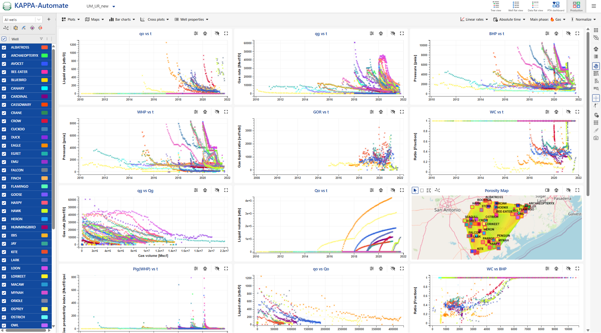 |
If well properties bar charts and cross plots are added to the results, the display appears as follows:
 |
If results tables are added, the display will appear as shown below:
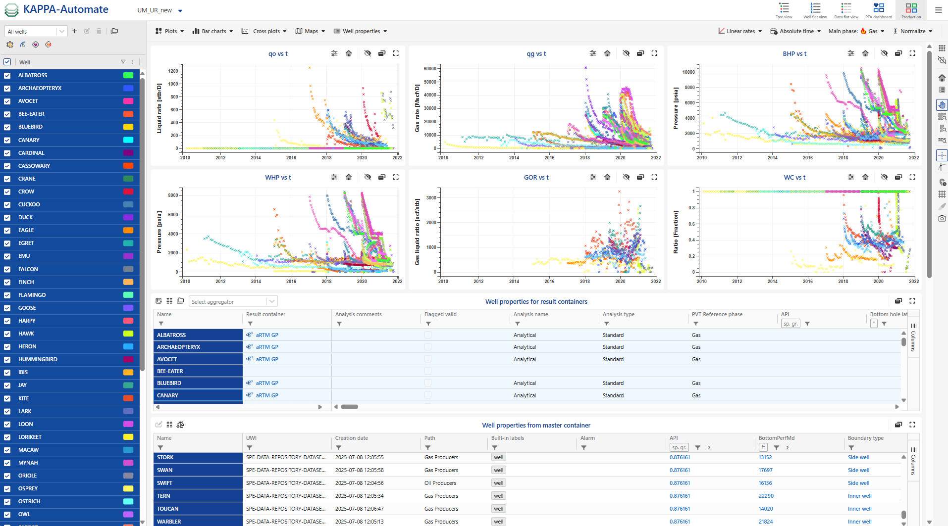 |
Table options
Pivot option
 , swap between columns and rows
Show only values with values using
 .
.Show results container in the plot using
 and select the container from the dropdown list.
Apply a single unit for all properties sharing the same measure

Plot options
On individual plots, the scale can be switched between linear and logarithmic by clicking the ,
 , and selecting the desired axis (X or Y).
Reset zoom using the reset option
 .
.Hide a plot using the Hide option ,
.Open a plot in a separate window using ,
.Expand or restore plots using the Maximize ,
 , and Minimize ,
 , options.
Toggle between Default and Compact layouts by clicking on
.The X-axis can be synchronized by clicking on
 .
.Zoom an individual plot using Ctrl + mouse wheel.
Map options can be accessed by clicking on
 option.
Wells can also be selected directly from the map options:
Sigle click selection ,.
Rectangular selection ,
 .
.Polygon selection ,
 .
.
Add/remove table columns by clicking on
 at the right of the table.
Highlight individual wells on all plots by clicking on them in the well list, the plots, or the map.
Highlight multiple wells on all plots:
CTRL or Shift key: select wells from the table and plots
Shift key: select wells from the map