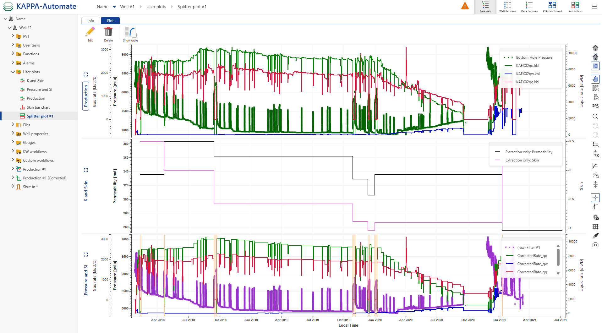
User Plots
User plot is a manual plot that can be created with any number of panes; each pane can combine data sets and well properties from the field hierarchy plotted versus time. In other words, user plots are a combination of data channel item plots for a selected well which has been defined by a user.
Creating a User Plot
Click Plot ,
 , under the Info tab, e.g., at the well level.
In the Create a new plot dialog, enter a Name and Label if necessary or leave the default one.
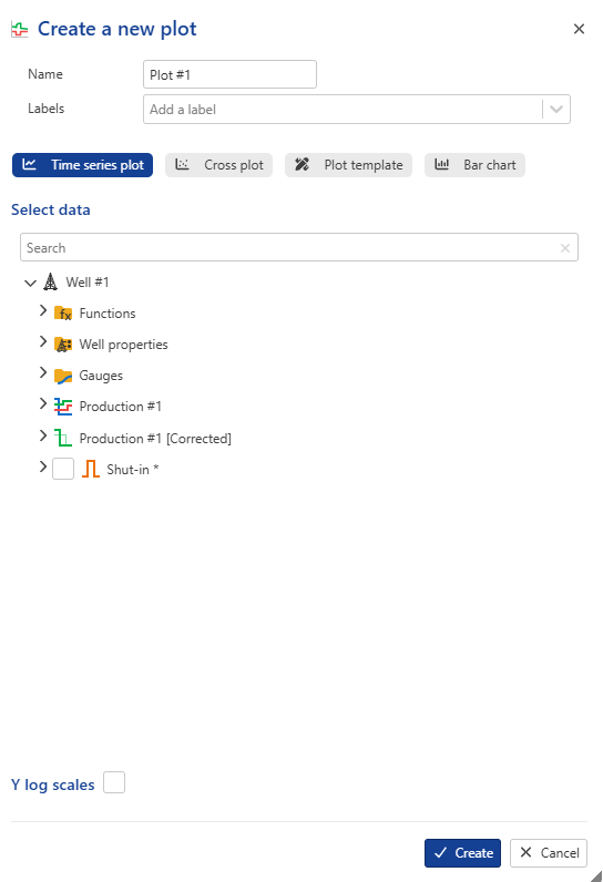
Decide what type of plot you need, Time series , Cross plot or Bar chart.
Select the desired data channels to display, such as Pressure, Gas, and Water.
If Time series plot is selected, the data channels will be plotted vs time.
For Cross plot, assign a data channel to the X-axis using the dropdown menu; remaining channels will be plotted against the selected one.
Choosing Bar Chart displays well properties in a bar format. For more details, refer to the section below.
Note
A Plot Template can be applied, as defined at the global K-A level under Automation Mode. Click Plot Template to select and apply the preferred layout.
Logarithmic scales can be applied as follows:
Y-axis: when using a Time Series Plot
Both X and Y axes: when using a Cross Plot.
Users can also search for a specific gauge or well property by name.
Click on Create to confirm the creation. The User plots node, containing the newly created Plot, is added under the Well node.
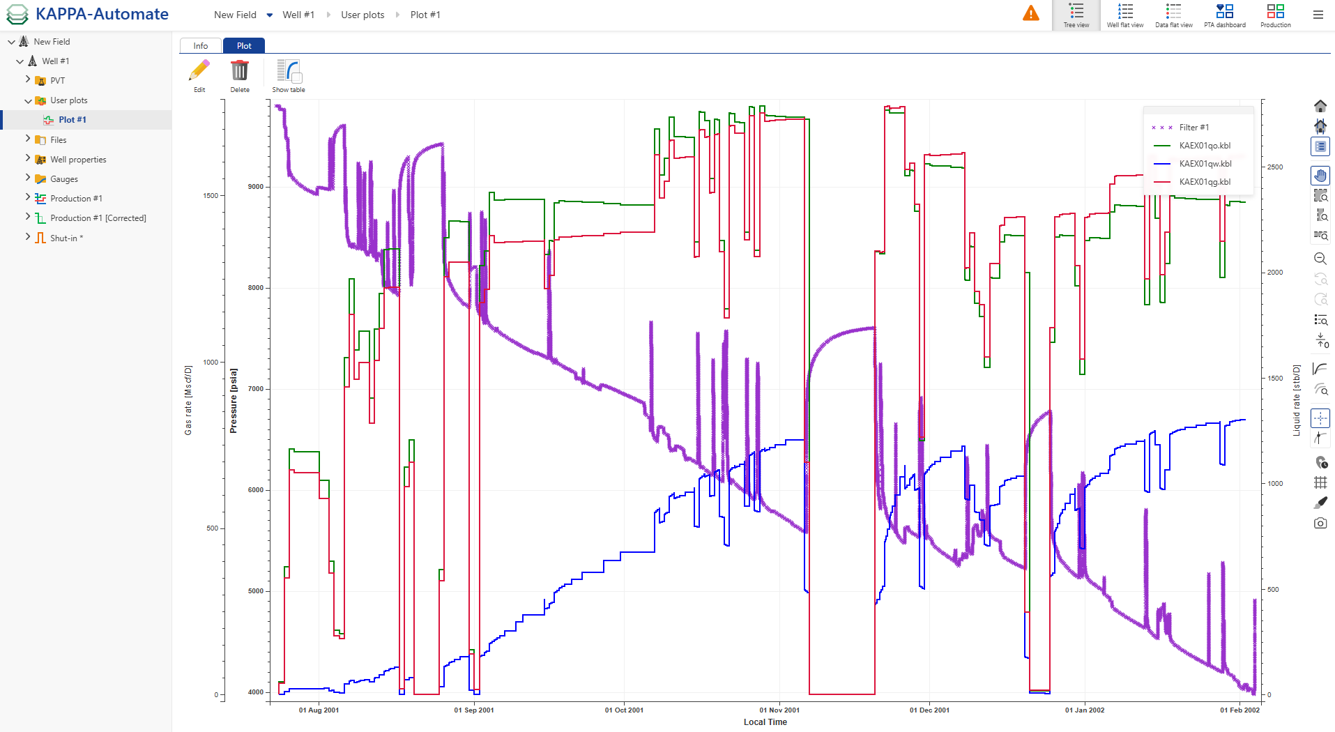
Tip
The plot can be customized, e.g., the marker type and color of the displayed channels can be changed, by clicking on the Edit aspect,
 , icon in the right-hand side toolbar.
Users can hide or show channels in the plot by clicking the corresponding icons in the legend:
 To show a channel.
 To hide a channel.
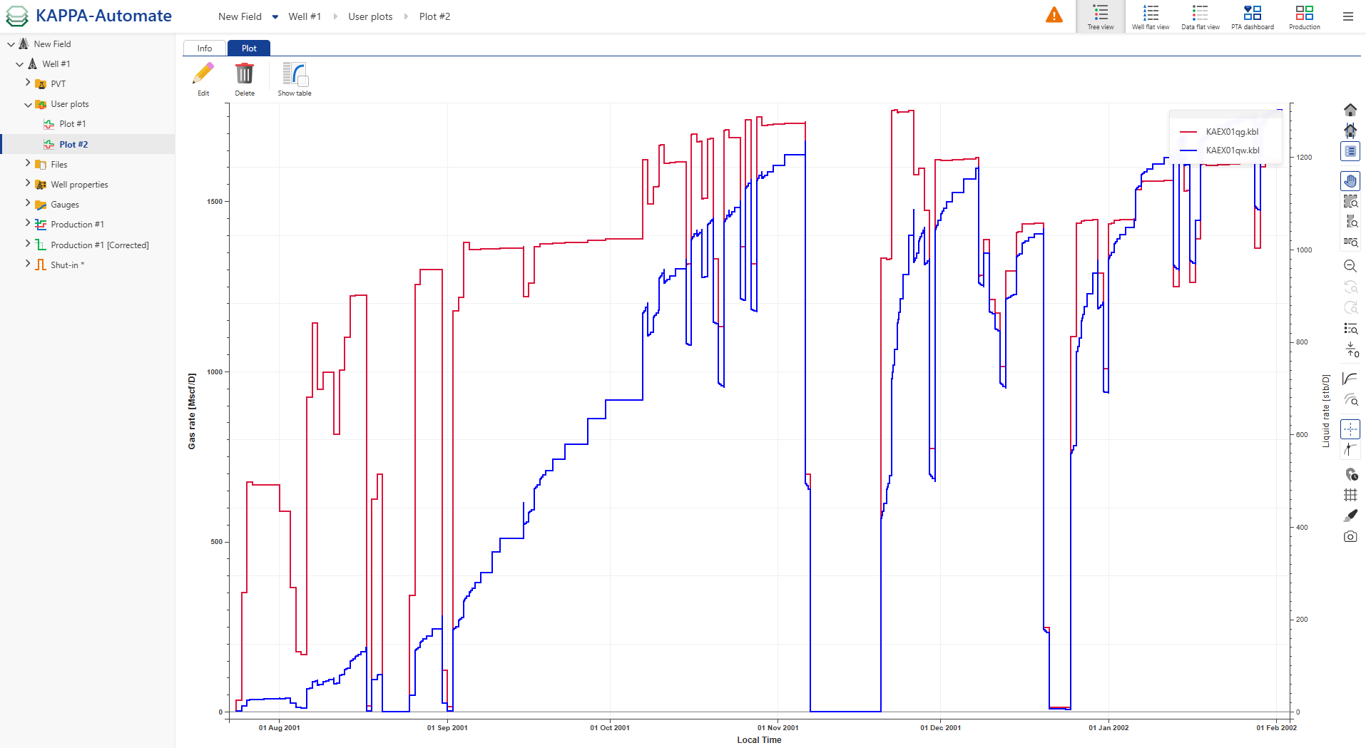
It is possible to create several plots. Under the User plots node, click Plot to create another plot and select e.g., gas and water for the second plot.
The newly created Plot #2 is added under the User plots node.
To display multiple user plots together, select the User Plots node in the field hierarchy, click Select plots,
 , and pick the plots to display: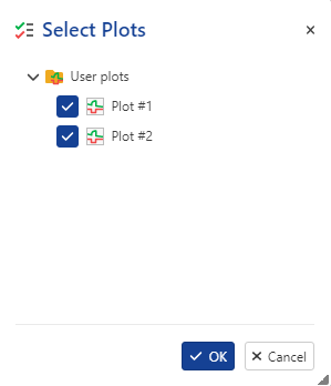
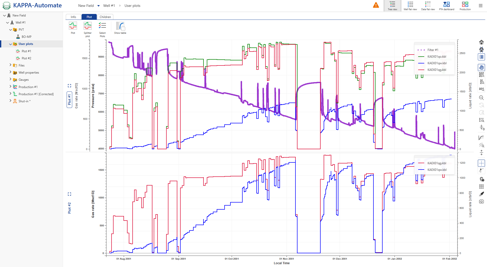
Both plots are then shown together.
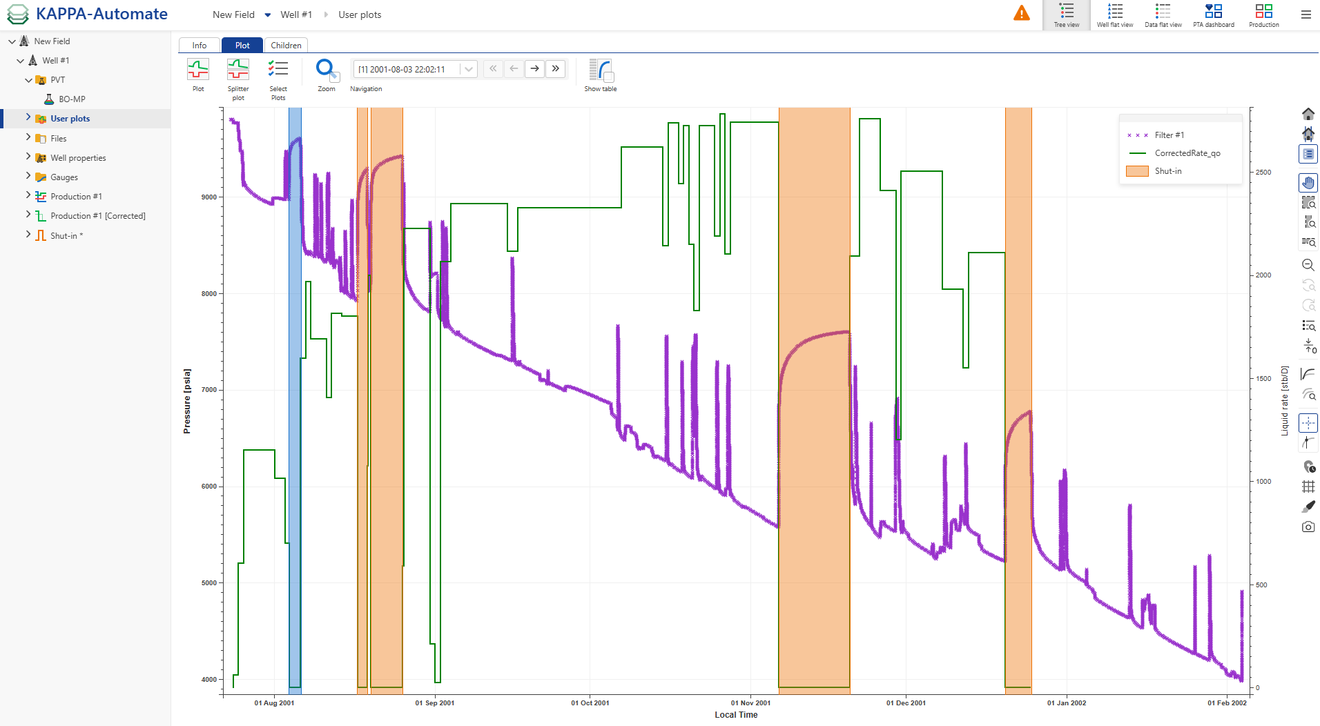
When displaying Shut-in, a zoom option for selected shut-ins and a shut-in navigation bar are added to the options at the top.
Tip
When having several panes displayed, users can maximize a pane for an expanded view by using the Expand view,  , icon and by clicking on the Restore view,
  , icon to collapse the view. Users can also double-click on the pane title to expand or collapse the view.
Note
Container names for well properties are now displayed on the user plot legend, making it easier for users to identify and distinguish different well properties directly on the plot.
Creating a Cross plot
Click Plot ,
, under the Info tab, e.g., at the well level.
In the Create a new plot dialog, enter a Name and Label if necessary or leave the default one.
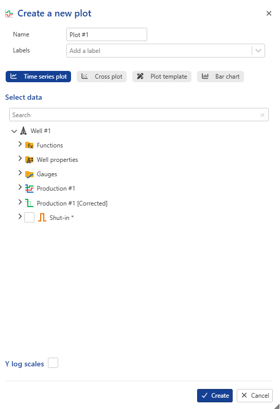
Select Cross plot.
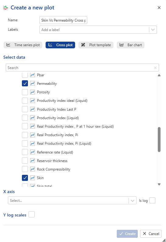
Select the desired well property dataset to display, such as Skin.
Click on Create to confirm the creation. The User plots node, containing the newly created Plot, is added under the Well node.
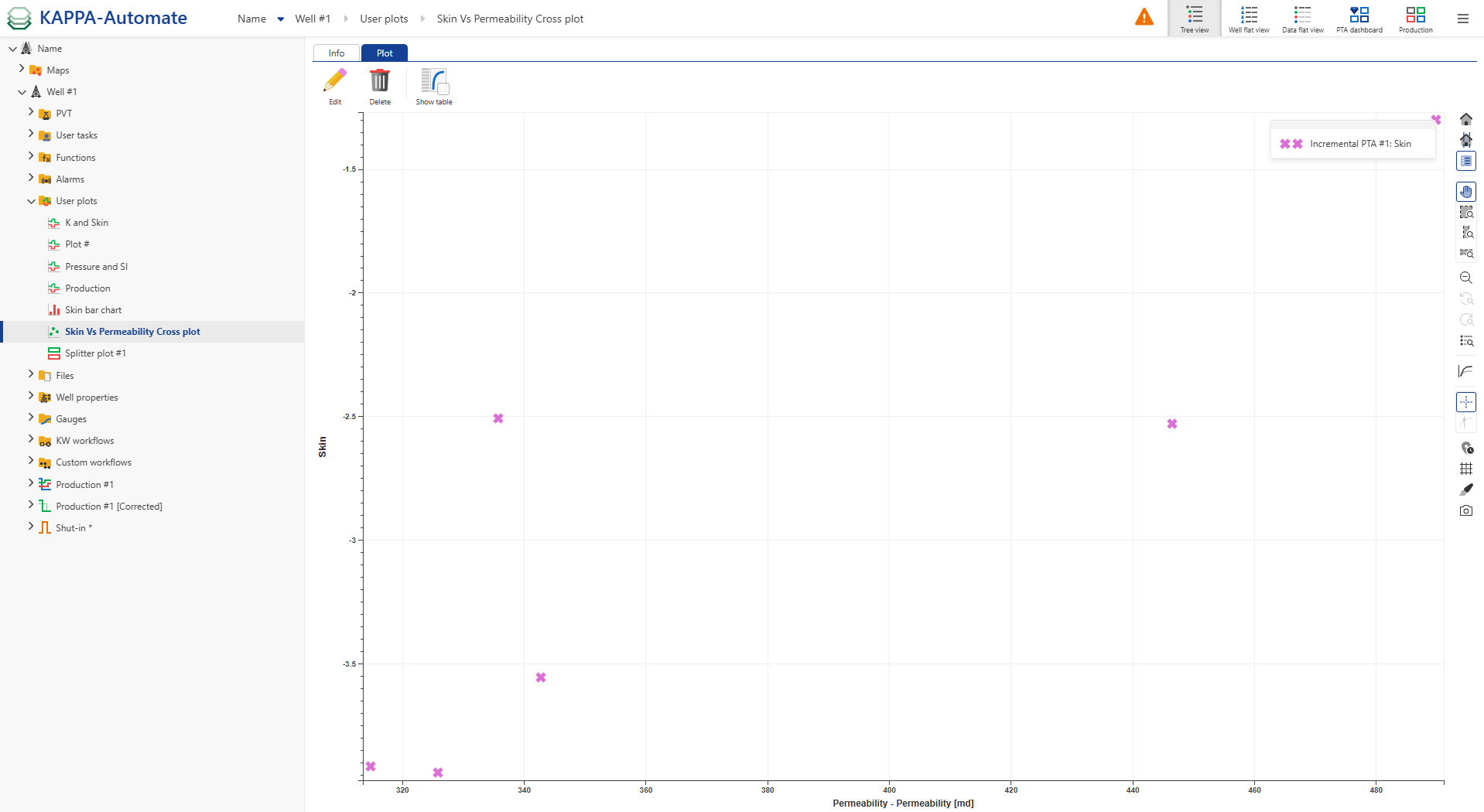
Creating a Bar chart
Click Plot ,
, under the Info tab, e.g., at the well level.
In the Create a new plot dialog, enter a Name and Label if necessary or leave the default one.
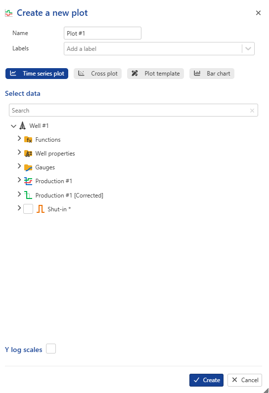
Select Bar chart.
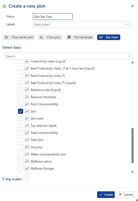
Select the desired well property dataset to display, such as Skin.
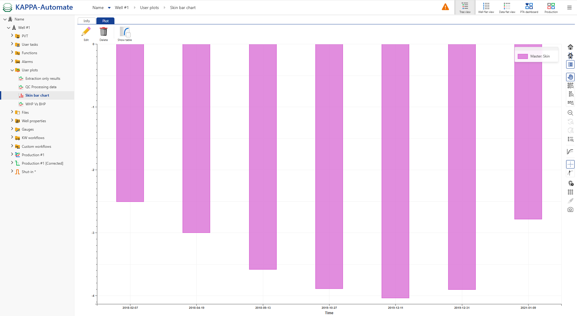
Click on Create to confirm the creation. The User plots node, containing the newly created Plot, is added under the Well node.
Creating a Splitter Plots
To create a plot combines multiple user plots together, select the User Plots node in the field hierarchy, click Splitter plots,
 , and pick the plots to display: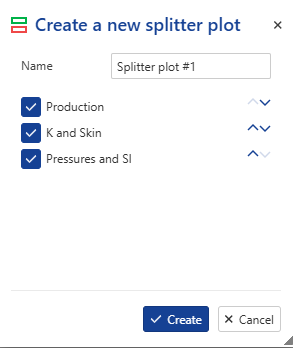
Note
Users can reorder plots using the dedicated button ,
 .
.All the three plots are then shown together.